Neutral fall kitchen decor with no orange in sight is easy to picture and surprisingly hard to pull off, because the problem nobody mentions is that a cream kitchen plus cream decor equals a kitchen that looks exactly the way it did in July. Most anti-orange fall posts are whole-home tours where the kitchen gets one photo at the end. This one stays in the kitchen and gives you the part those posts skip: which browns actually contrast with which whites, and how to use texture plus one dark element so the decor is visible from across the room. Nineteen ideas, grouped by material. Save this to Pinterest so you have it when you start swapping things out in September.
1. Speckled Oatmeal Stoneware Crock Beside the Range
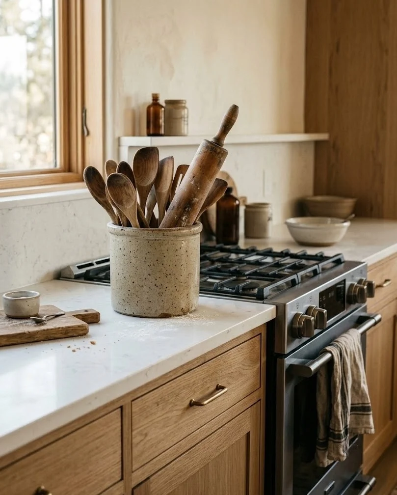
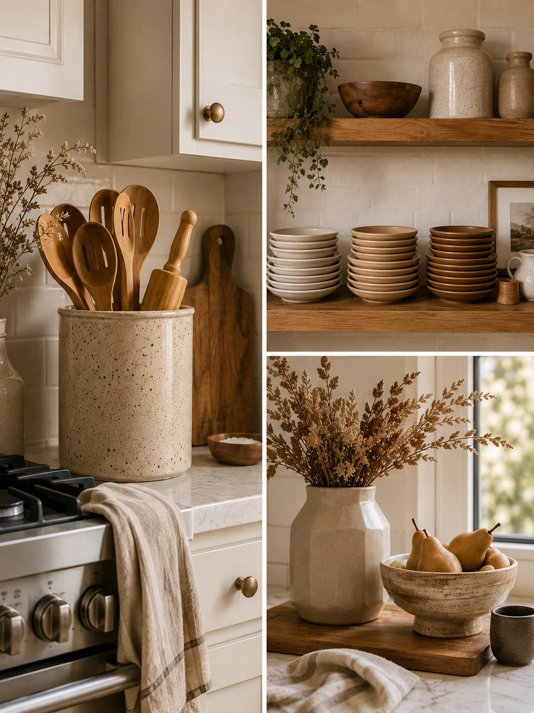
A wide speckled stoneware crock holding wooden spoons is the fastest neutral fall swap in a kitchen, because the iron-flecked glaze reads warm and earthy without borrowing a single autumn color. Look for a crock in the 6 to 7 inch height range; shorter than that and long spoons tip it over, taller and it starts blocking the backsplash. Set it on the counter side of your range rather than the sink side so it stays dry. The detail that makes it work is the speckle itself. Those scattered brown flecks give a white kitchen something to catch on, while a glossy pure-white utensil holder does the opposite and disappears against the cabinet doors.
2. Matte Bisque Plates Stacked in Three Tones on Open Shelving
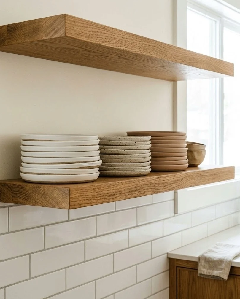
Three stacks of matte bisque plates in slightly different tones do more for a neutral kitchen than any single decorative object, because the tonal steps create depth on a shelf that would otherwise read flat. Buy one stack in warm white, one in oatmeal, one in a light clay brown, then arrange them light to dark from left to right so the eye moves across the shelf. Keep each stack to five or six plates. Taller than that and the shelf feels like storage instead of styling. Matte finish matters here more than the color does: gloss bounces light straight back at you and flattens the tonal difference you just paid for.
3. Dark Clay Bread Bowl Filled With Cream Faux Pumpkins
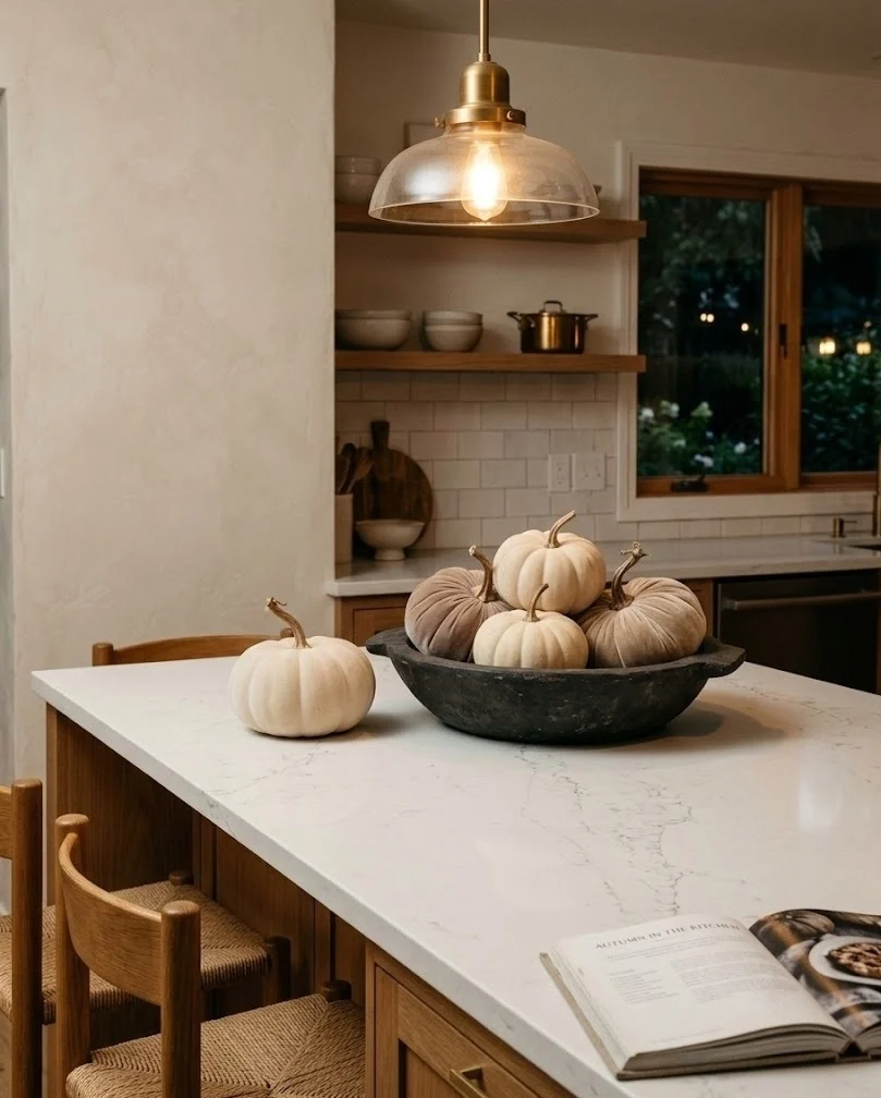
A shallow dark clay bowl filled with cream and bone faux pumpkins is the one place fall announces itself in this kitchen, and the dark bowl is what keeps the whole arrangement from vanishing. Cream faux pumpkins sitting directly on a white quartz island look like nothing from six feet away. Drop them into a bowl in deep brown or charcoal clay and suddenly there is an edge for them to sit against. Use odd numbers, three large or five mixed sizes, and let one sit slightly outside the bowl so the group does not look staged. Matte pumpkins only, because gloss is what makes faux ones look like plastic. The speckled glaze from idea 1 works well on the bowl too, and the repeat ties the counter back to the range.
4. Peg Rail of Mugs in Bark and Mushroom Glazes
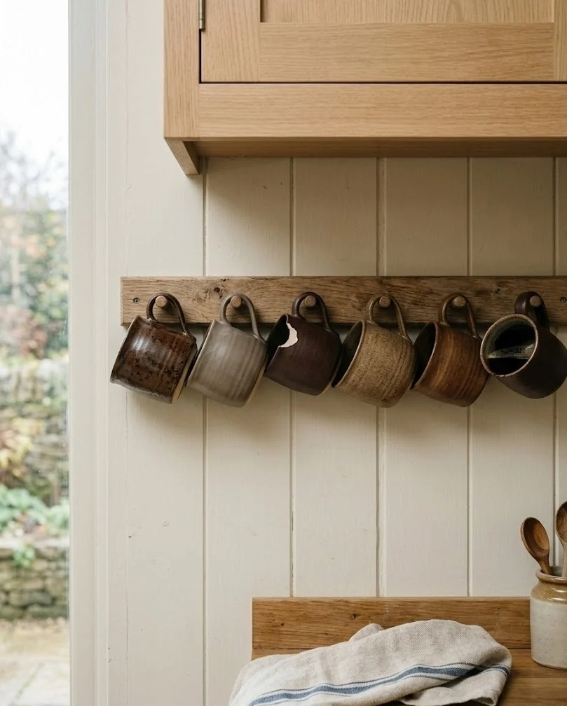
A simple peg rail under an upper cabinet, hung with mugs in bark brown and mushroom glazes, adds seasonal color at eye level without giving up any counter space. Mount it 10 to 12 inches below the cabinet so the mugs clear the counter and you can still reach the outlet behind them. Six pegs is usually the sweet spot; past eight it turns into a wall of handles. Mix the glazes on purpose, two or three tones rather than a matched set, so the rail looks collected over time rather than bought in one order. Renters can use removable strips rated for five pounds or more, though heavy stoneware is safer on screws driven into a stud.
5. Wheat Sheaf in a Tall Ceramic Vase by the Window
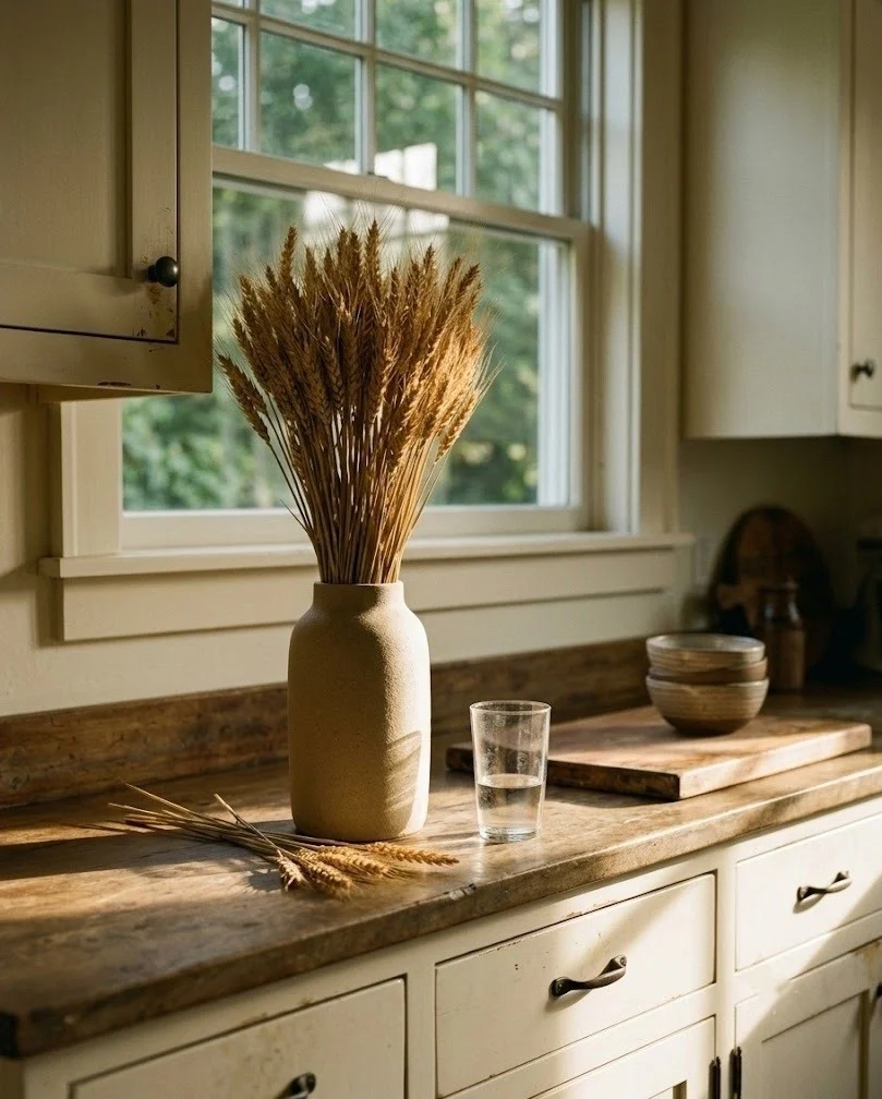
A tight bundle of dried wheat in a tall ceramic vase gives a kitchen the gold-and-tan color of harvest fields without one drop of orange, and the vertical line breaks up a long run of flat cabinet fronts. Cut the stems so the heads sit at roughly one and a half times the vase height, which stops the bundle from looking top heavy. Forty to sixty stems reads full; twenty looks apologetic. Keep it away from the range, because wheat heads collect grease and then shatter into crumbs as they dry further. Dried wheat and bunny tail stems are cheap enough to replace annually, so treat them as a seasonal purchase rather than a permanent one.
6. Bunny Tail Stems in Small Bud Vases Along the Sill
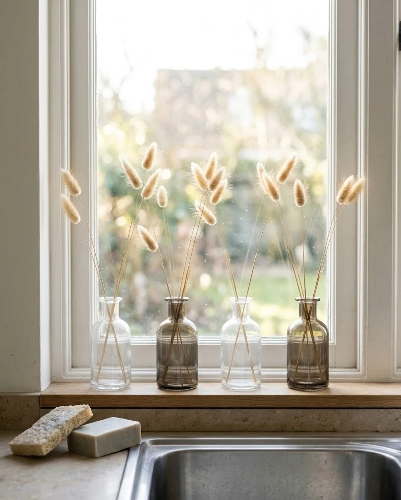
Three or four small bud vases holding a few bunny tail stems each, lined along the windowsill, do the same job as one large arrangement while taking up almost no depth. Space them unevenly and vary the heights slightly, because a perfectly even row reads like a store display. Two to three stems per vase is plenty; overfilling a bud vase kills the delicate silhouette that makes bunny tails worth using in the first place. Clear or smoked glass both work, though smoked keeps the sill from looking busy when morning sun comes straight through. This is the arrangement to try first if you are not sure dried stems suit your kitchen at all.
7. Parchment-Toned Dried Hydrangea Wreath in the Sink Window
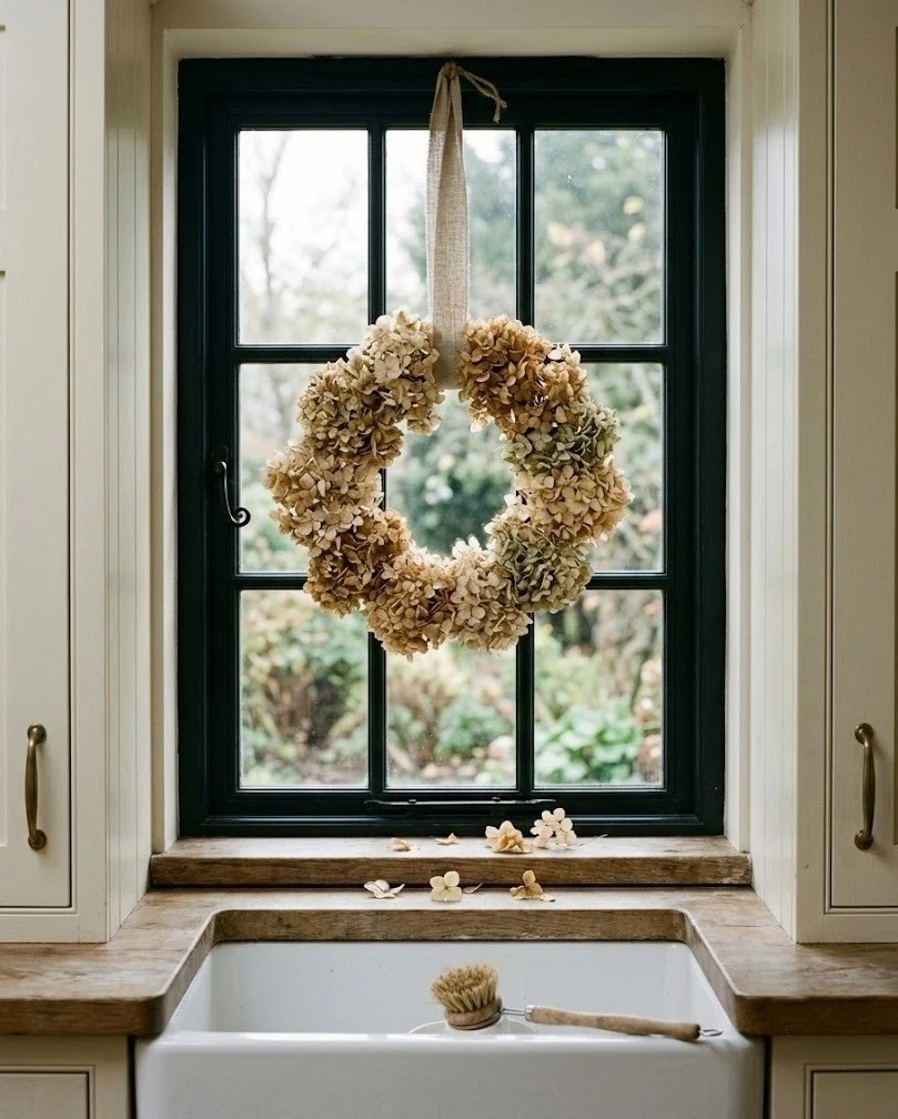
A dried hydrangea wreath in parchment and faded tan brings fall texture to the one wall in a kitchen that usually gets ignored. Hydrangea dries to a papery, faintly greenish cream that sits very close to most cabinet colors, so hang it against glass or a darker wall rather than on white paint where it will simply merge. A 14 to 16 inch wreath suits a standard window; anything larger blocks light you actually need over the sink. Use a ribbon looped over the window frame instead of a nail so you can take it down without patching. Pairing it with the wheat from idea 5 across the room makes the dried texture appear twice rather than once.
8. Eucalyptus and Pampas Bundles Hung From a Rack Over the Island
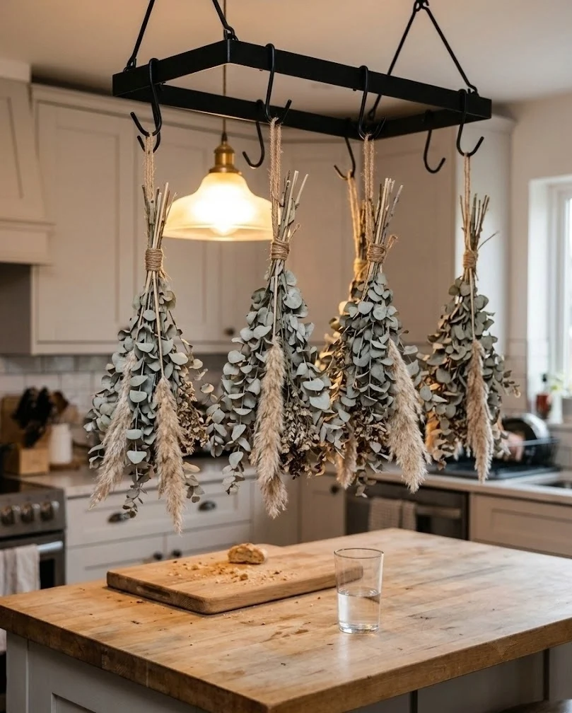
Stems hung upside down from a rack above the island turn the drying process itself into the decoration, which is about the most honest fall look a working kitchen can have. Use a plain wood or black iron rack suspended 30 to 36 inches above the counter so nobody walks into a bundle mid-conversation. Group eucalyptus, small pampas plumes and a few seeded stems into bundles of five, tie with jute, and space the bundles at least six inches apart so each keeps its own shape. Eucalyptus holds its silvery green for months and smells faintly herbal every time you brush it. Skip this entirely if your ceilings are under eight feet.
9. End-Grain Butcher Block Boards Leaned Against the Backsplash
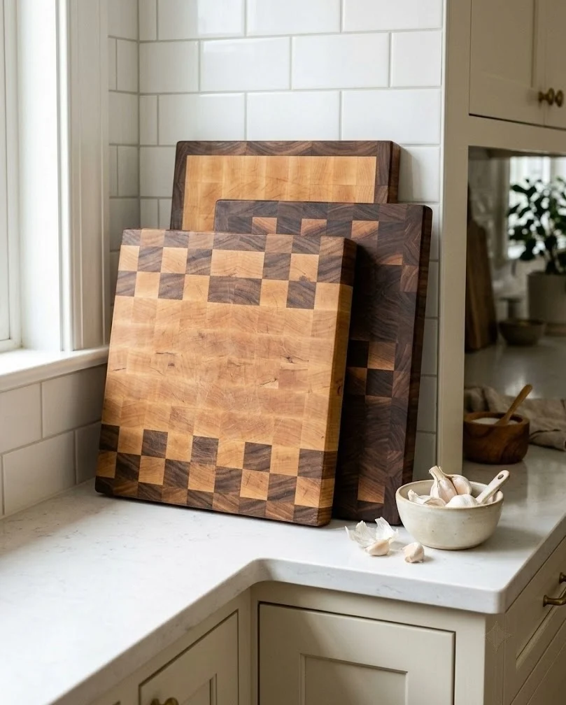
Two or three end-grain butcher block boards leaned against the backsplash give a white kitchen the warm mid-brown it is usually missing, and unlike a purely decorative object they get pulled down and used. Lean them at the end of a counter run rather than dead center, overlapping the fronts slightly so you read three edges instead of one flat face. End grain shows the checkerboard pattern that registers as texture from across the room, while edge grain just looks like a plank. Buy in two different woods, maple and walnut for instance. A matched pair looks like a set someone bought; two tones look like a kitchen someone actually cooks in.
10. Raw-Edge Wood Riser Lifting the Coffee Corner
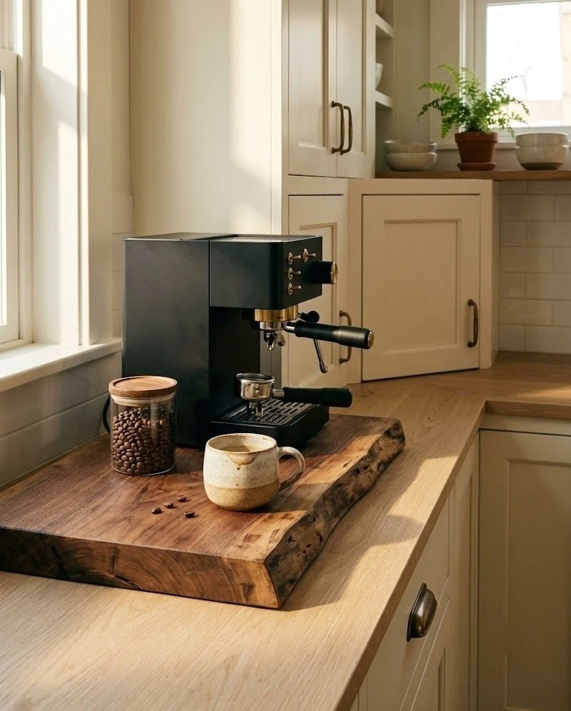
Setting the coffee machine on a thick raw-edge wood riser separates it from the rest of the counter and adds a slab of warm tone at exactly the height you see every morning. Two inches of thickness is the minimum for the riser to read as solid rather than as a tray. Keep the footprint about two inches wider than the machine on each side so the wood frames it instead of hiding underneath. Unfinished wood next to a coffee machine will stain within a month, so a hardwax oil finish is worth the extra twenty dollars. The walnut from idea 9 repeats well here if you want the browns in the room to agree with each other.
11. Oversized Seagrass Basket Tipped Forward on Top of the Cabinets
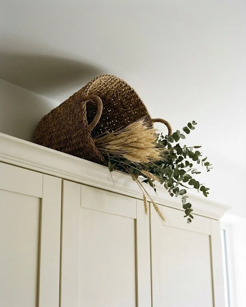
One large woven seagrass basket on top of the cabinets, tipped slightly forward with dried stems spilling out, fills the dead gap above the uppers without adding clutter you have to dust every week. Go bigger than feels comfortable: a basket under 14 inches wide looks lost up there once you step back. A single basket placed off center beats three spaced evenly, which always reads as builder-grade staging. Choose mid-brown seagrass or rattan rather than pale straw, because pale straw against cream cabinets is precisely the beige-on-beige trap this whole post exists to avoid. Contrast is what makes neutral decor visible at all.
12. Reclaimed Oak Floating Shelf Where an Upper Cabinet Used to Be
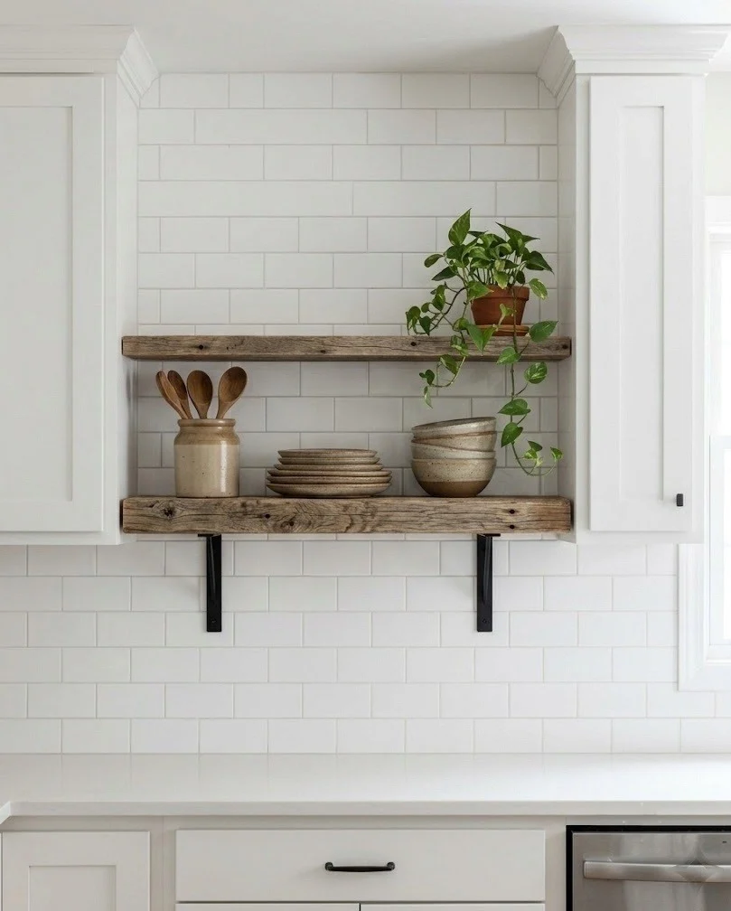
Swapping one upper cabinet for a reclaimed oak floating shelf gives fall styling a permanent home, and the aged grain does far more visual work than a new pine shelf ever will. A depth of 8 to 10 inches holds plates and crocks without eating into usable counter space. Mount it 18 inches above the counter to match standard cabinet clearance so the run still looks deliberate rather than half-finished. Reclaimed oak arrives with old nail holes and color variation, which is exactly the point; sanding it perfectly smooth removes the reason you paid for reclaimed in the first place. Seal with a matte finish so it does not yellow against a white backsplash.
13. Unlacquered Brass Pulls on the Lower Cabinets Only
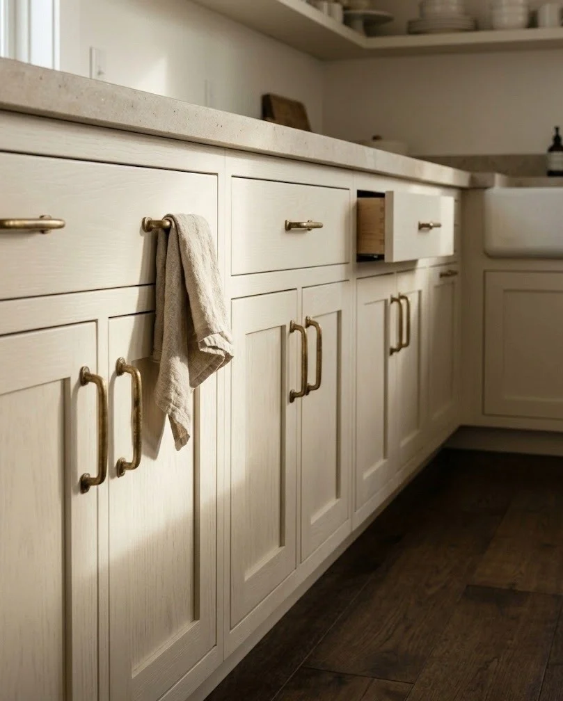
Unlacquered brass pulls on the lower cabinets give a kitchen a warm metal note that deepens as it ages, and limiting them to the lowers costs a fraction of doing the entire room. Unlacquered means the finish darkens and takes fingerprints over the first few months, ending up closer to antique gold than the bright yellow it ships as. That patina is what makes brass read fall instead of showroom. Measure your existing hole spacing before ordering, usually 3 inches or 96 millimeters on older cabinets. If the current hardware is chrome, do not mix within a run; swap all the lowers so it reads as a decision. Against the reclaimed oak shelf in idea 12, brass looks best of all.
14. Copper Pans Hung on a Rail Above the Range
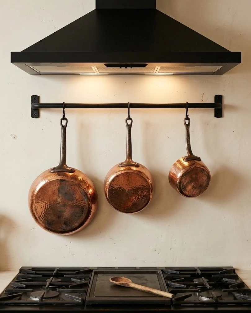
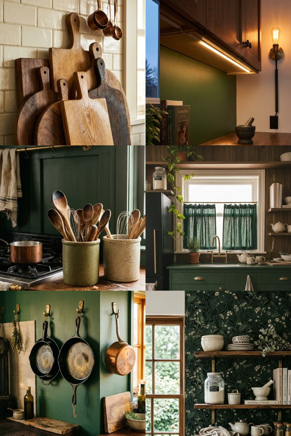
Two or three copper pans hung on a rail above the range put the warmest metal in the room exactly where the light hits it, and copper is the one accent that carries autumn feeling without any orange in the decor itself. Hang the rail 24 to 30 inches above the cooktop so handles clear your head and the pans stay out of direct flame. Real copper needs polishing every few weeks if you want it bright, or you can let it darken into a deep brown, which honestly suits a neutral kitchen better. Copper and brass accents can share a room as long as one clearly leads and the other appears only once or twice.
15. Three Aged Brass Candlesticks at Staggered Heights on the Island
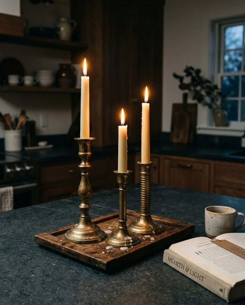
A cluster of three aged brass candlesticks at staggered heights turns an island into the evening version of the kitchen, which is when fall decor actually earns its keep. Vary the heights by at least two inches between each piece, or the group reads as a matched set doing nothing interesting. Use cream or bone tapers, never bright white; white wax against brass looks like a wedding table rather than a kitchen. Keep the cluster on a small tray or a slab of wood so the whole group moves off the island in one motion when you need the counter for actual cooking. Thrift stores are full of brass candlesticks, and mismatched shapes beat a bought trio.
16. Washed Linen Tea Towels in Flax and Chestnut on the Oven Bar
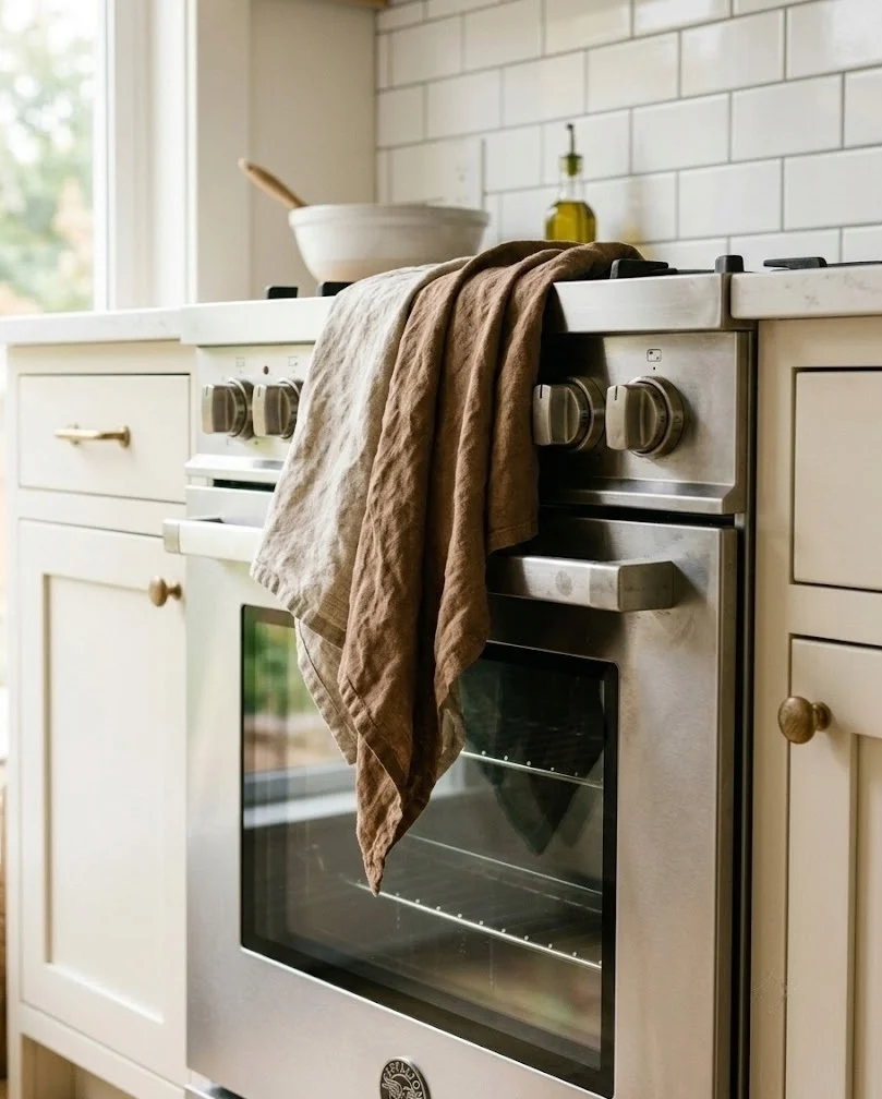
Washed linen tea towels in flax and chestnut on the oven bar are the cheapest color change available in a kitchen, and the one most people get wrong by buying a pretty set they then use for drying dishes. Buy two sets: rough cotton for actual work, linen for the bar. Mid-brown or warm flax linen breaks up the stainless front of a range better than any white towel can. Skip printed leaves and plaid borders entirely, because the print is what tips a neutral kitchen into costume territory. Iron the packaging fold out before hanging or that crease stays visible for weeks. The tonal stacking trick from idea 2 works here too, layering two tones instead of one.
17. Unlined Flax Linen Cafe Curtain Across the Sink Window
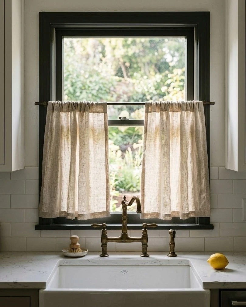
A half-height linen cafe curtain on the sink window softens the hardest surfaces in a kitchen and filters the low autumn sun that otherwise glares straight off the counter around four o'clock. Hang the rod at the vertical midpoint of the window, or slightly above if privacy matters, and let the fabric end at the sill rather than hanging past it. Unlined oatmeal or flax linen keeps the light coming through, while a heavy lined panel makes the whole sink corner gloomy on short October afternoons. Allow one and a half times the window width in fabric so it gathers properly instead of stretching flat. A tension rod inside the frame works when drilling is not an option.
18. Smoked Glass Canisters Holding Flour, Oats and Rice
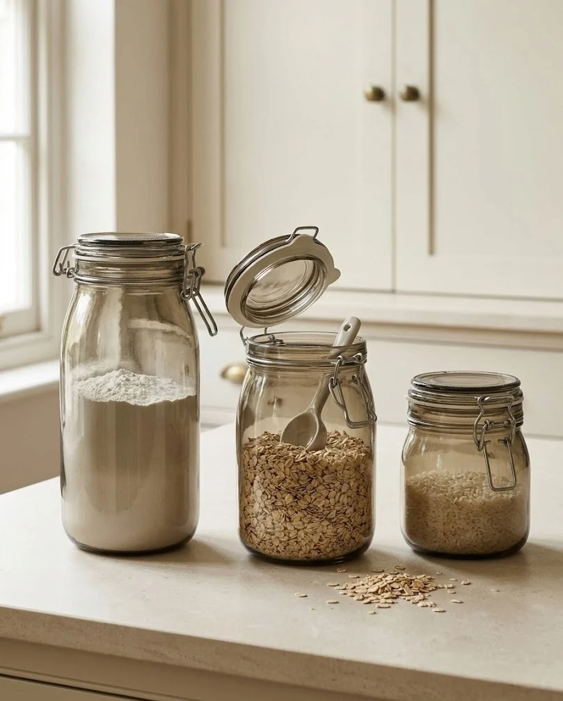
Smoked glass canisters holding flour, oats and rice bring a genuinely dark element into a pale kitchen while still doing a real job, which is the trick to decor that survives past October. The tint hides the contents just enough that a half-used bag of oats stops looking messy, unlike clear jars which quietly demand you keep everything topped up. Choose bail-top or gasketed lids for anything used weekly. Three canisters in graduated heights beside the coffee corner is enough; a full row starts to look like the pantry moved out onto the counter. This is the piece that anchors the whole neutral fall kitchen decor scheme visually.
19. Smoked Glass Hurricanes With Pillar Candles on the Island
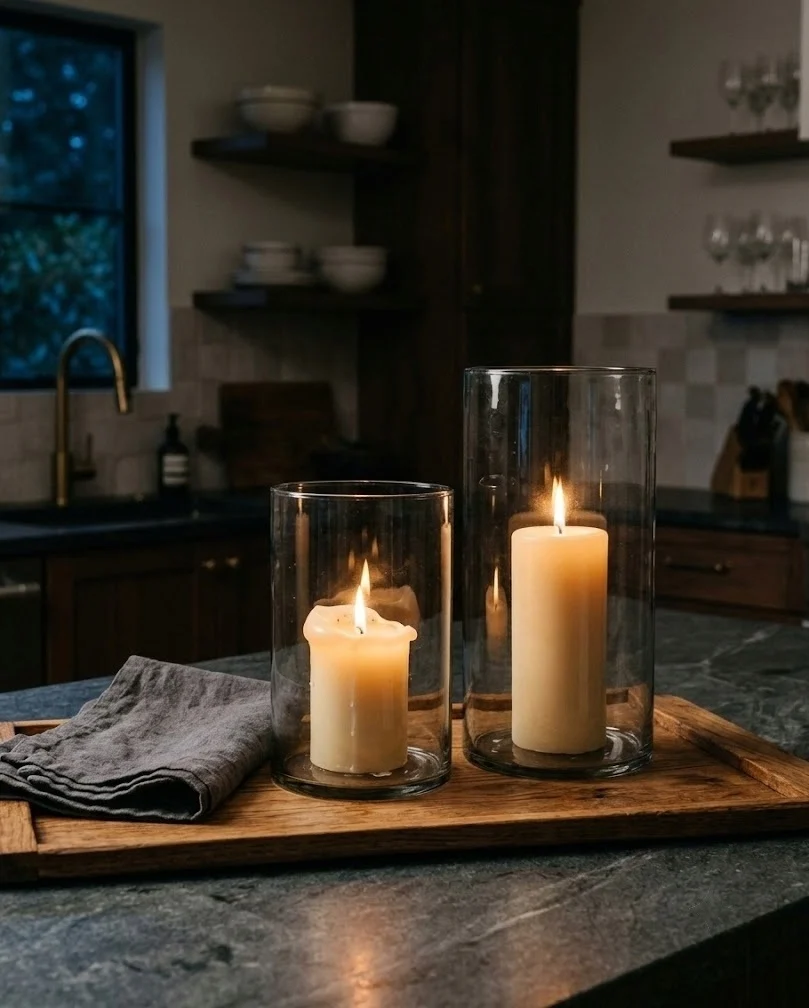
Smoked glass hurricanes with pillar candles inside give an island the darkest point in the room, and a dark point is precisely what neutral fall decor needs to stop reading as beige on beige. Two hurricanes at different heights beat a matched pair every time, since the height difference is what makes the grouping look considered. Smoked glass throws a warmer, dimmer light than clear glass does, which suits the shorter evenings this whole scheme is built around. Set them on the same tray as the brass candlesticks from idea 15 if you would rather have one strong grouping than two weak ones. Keep pillar wicks an inch below the rim so the glass does not soot up.
Final Thoughts
The thread running through all nineteen is contrast, not color. A neutral kitchen already has cream and white handled, so every piece you add should bring something the room does not have yet: a darker brown, a rougher texture, a warmer metal, a papery dried stem. Start with the stoneware crock and one dark bowl, live with it for a week, then add stems and linen. Save this post to Pinterest so the list is waiting when the light changes.
Frequently Asked Questions
what colors should I use for fall decor if I hate orange?
Cream, oatmeal, mid brown, chestnut and one deep clay or charcoal as your anchor. Fall reads as fall through warmth and texture far more than through orange, so warm-toned neutrals plus dried botanicals and aged brass carry the season on their own. The one rule worth keeping: include at least one tone darker than your cabinets, or the whole palette blurs together.
how do I make neutral fall decor show up in an already beige kitchen?
Add contrast in value, not in color. Beige decor disappears in a beige kitchen because everything sits at the same lightness. Bring in one element several shades darker, such as a dark clay bowl, smoked glass, walnut or unlacquered brass, and let the cream pieces sit against it. Texture finishes the job, since matte, woven and papery surfaces read differently even in the same tone.
when should I put out fall kitchen decor?
Late August through the first week of September works for most of the US, a little earlier in northern states. Dried stems and stoneware can stay out year-round without looking off-season, so the only pieces genuinely worth timing are the faux pumpkins and the wreath. Pull those the week after Thanksgiving and the kitchen slides into winter without a full reset.
are white pumpkins better than orange ones in a neutral kitchen?
Yes, but only if you give them a dark surface to sit against. Cream and bone faux pumpkins on a white counter effectively vanish from a few feet away. In a dark clay bowl, on a walnut board or on a smoked glass tray they read clearly. Buy matte rather than glossy, because gloss is what makes faux pumpkins look plastic.